
CommonWealth Education Media and Publishing has long been committed to exploring and addressing education and parenting topics. Through years of experience, we've realized that educational innovators, who often serve as pioneers, need a platform to connect and pool resources for sustainable impact. To address this need, we've established a non-profit organization, the CommonWealth Education Innovation Hub. This organization will serve as a hub for education innovation, fostering collaboration and dialogue among stakeholders. By connecting resources and facilitating cross-sector partnerships, we aim to create a thriving ecosystem for education innovation and address the evolving needs of our society.
Goals:
In the past, EduInno Hub organized a variety of exchange activities, with event-specific web pages serving as the primary online presence. With new plans in the coming year, the redesigned official website will not only consolidate past and future project information but also promote the center's mission. The website is envisioned as a hub to advocate for the center's values and serve as a platform to amplify its message: “A space to incubate educational beliefs and drive innovative energy.”
User Needs and Visual Design Proposal:
To understand the center’s core values and key objectives, I would first provide a questionnaire to gather insights from the client. This would clarify the organization’s mission, “to serve as a platform that connects resources to advance educational and cultural innovation, fostering a collaborative and innovative ecosystem.” Additionally, the questionnaire would determine what information the website should communicate, such as its role as “an incubator for educational beliefs and a platform for exchanging innovative ideas.”
During the visual design meeting, I presented concepts derived from the questionnaire findings, which included two primary stylistic directions: “innovation and forward-thinking” and “incubation and co-creation.” Based on the client’s feedback, we focused on the “incubation and co-creation” style, using circular and fluid graphic elements to symbolize creativity and interaction. The design also incorporates segmented content layouts to “connect” different elements, emphasizing collaboration and growth.
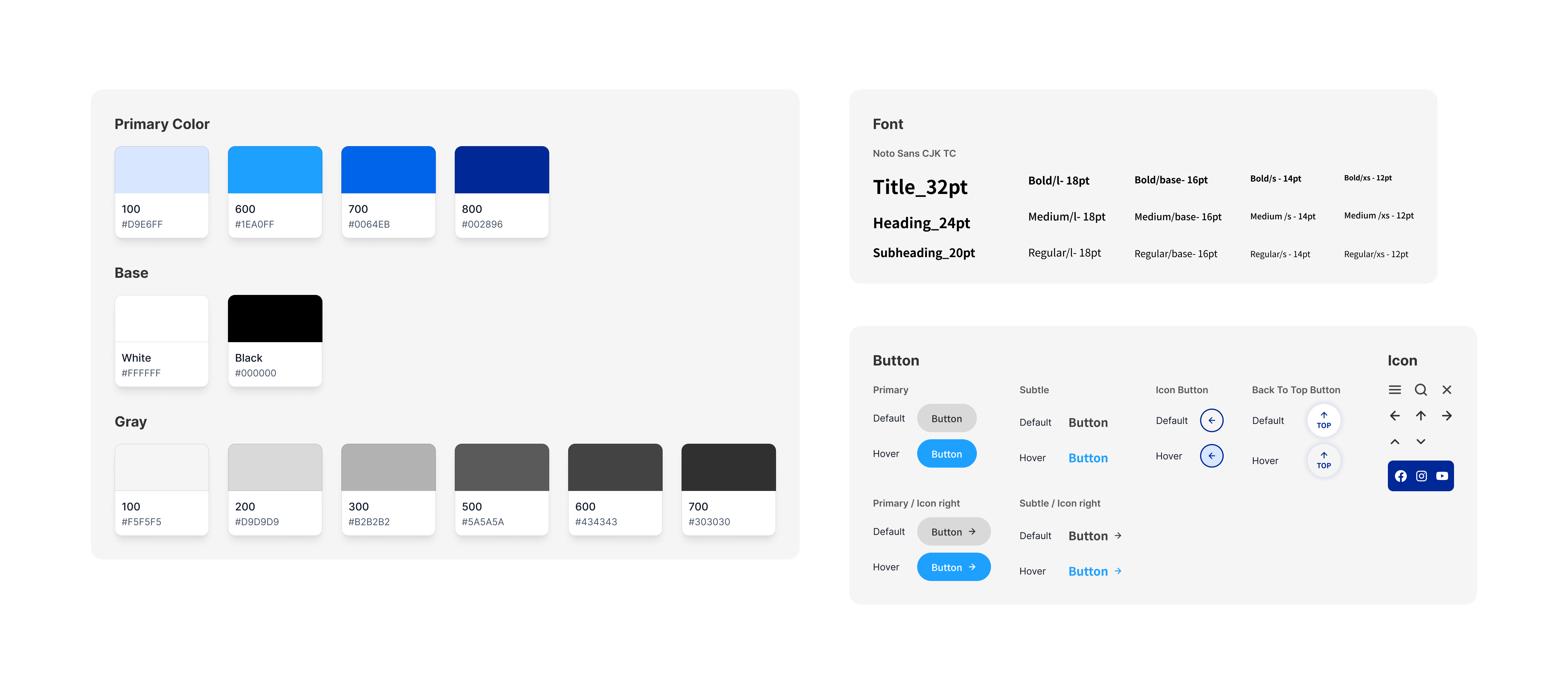
The website’s color palette was developed from the center’s existing visual identity system. To meet the client’s expectations, we extended the current color scheme and selected neutral blue tones paired with gray as the primary colors. This choice reflects the center’s professional and forward-thinking identity while maintaining alignment with its established branding.
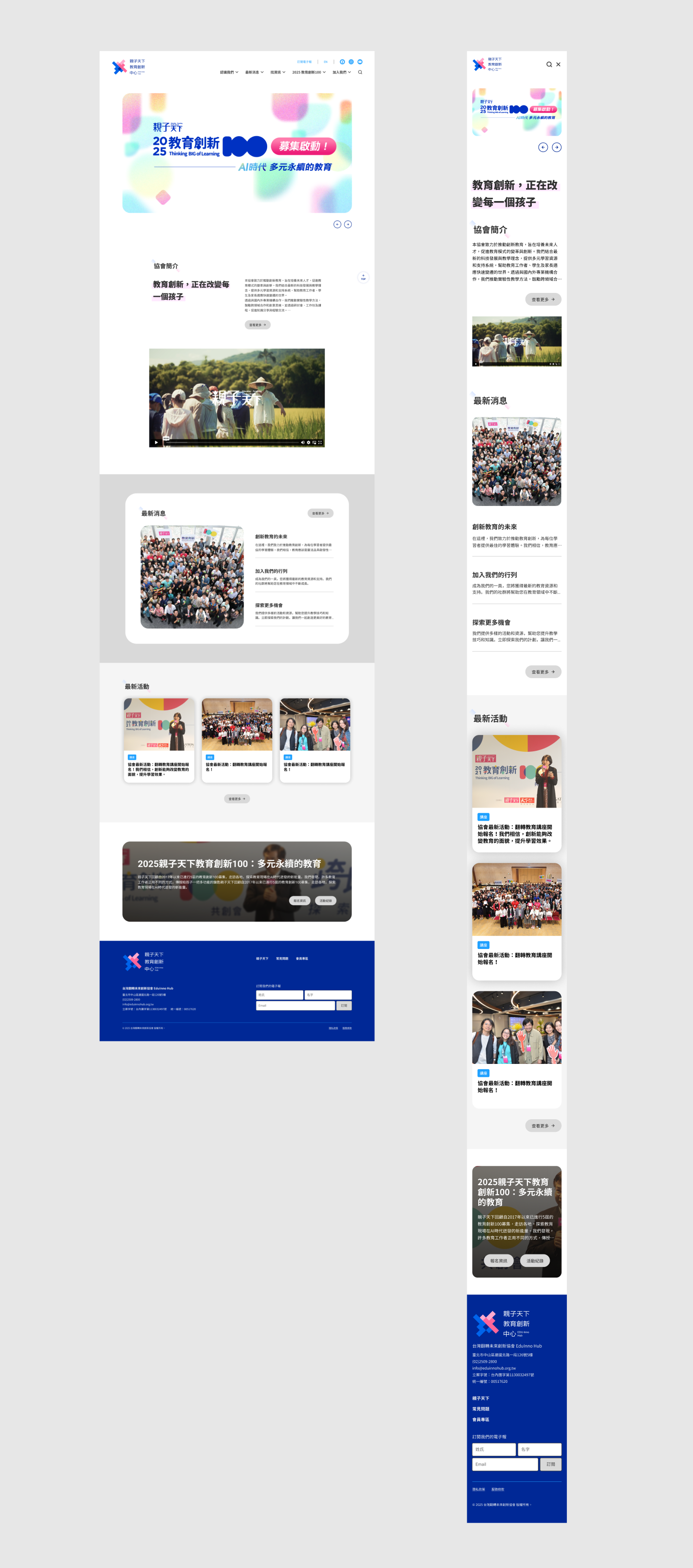


A dedicated section to highlight ongoing projects, ensuring the content remains up-to-date and relevant.